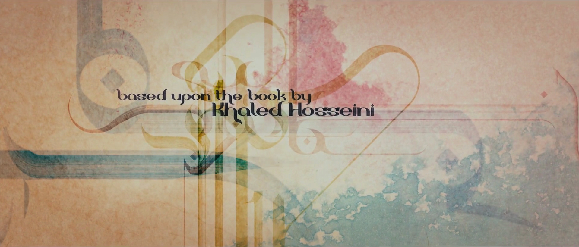
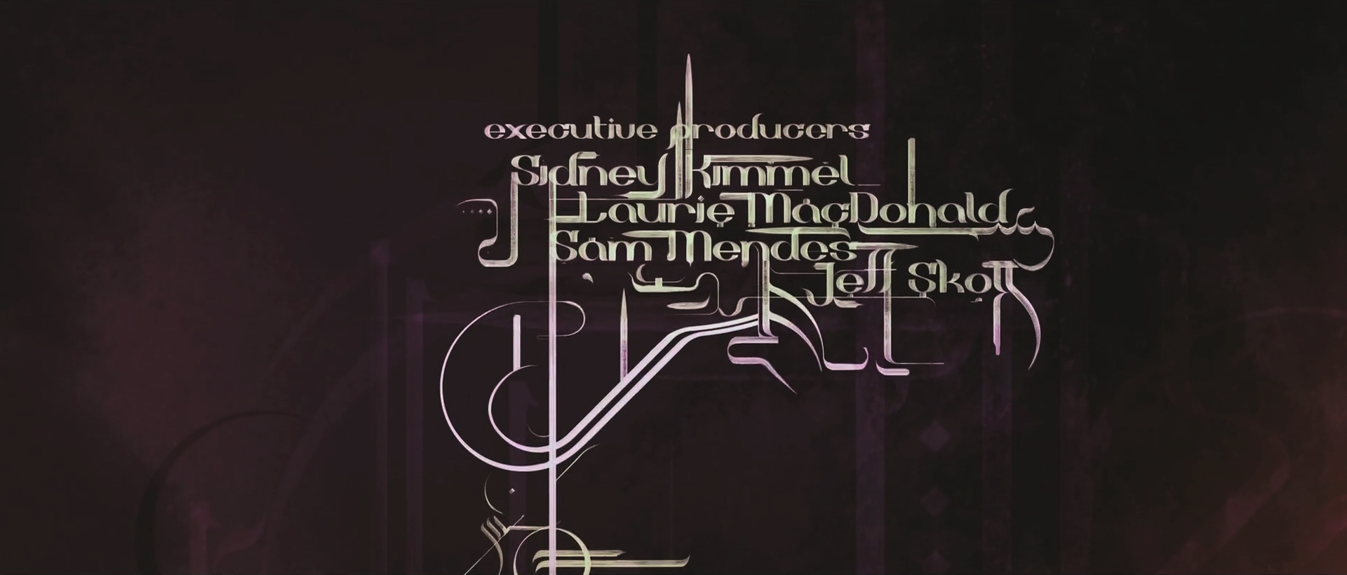
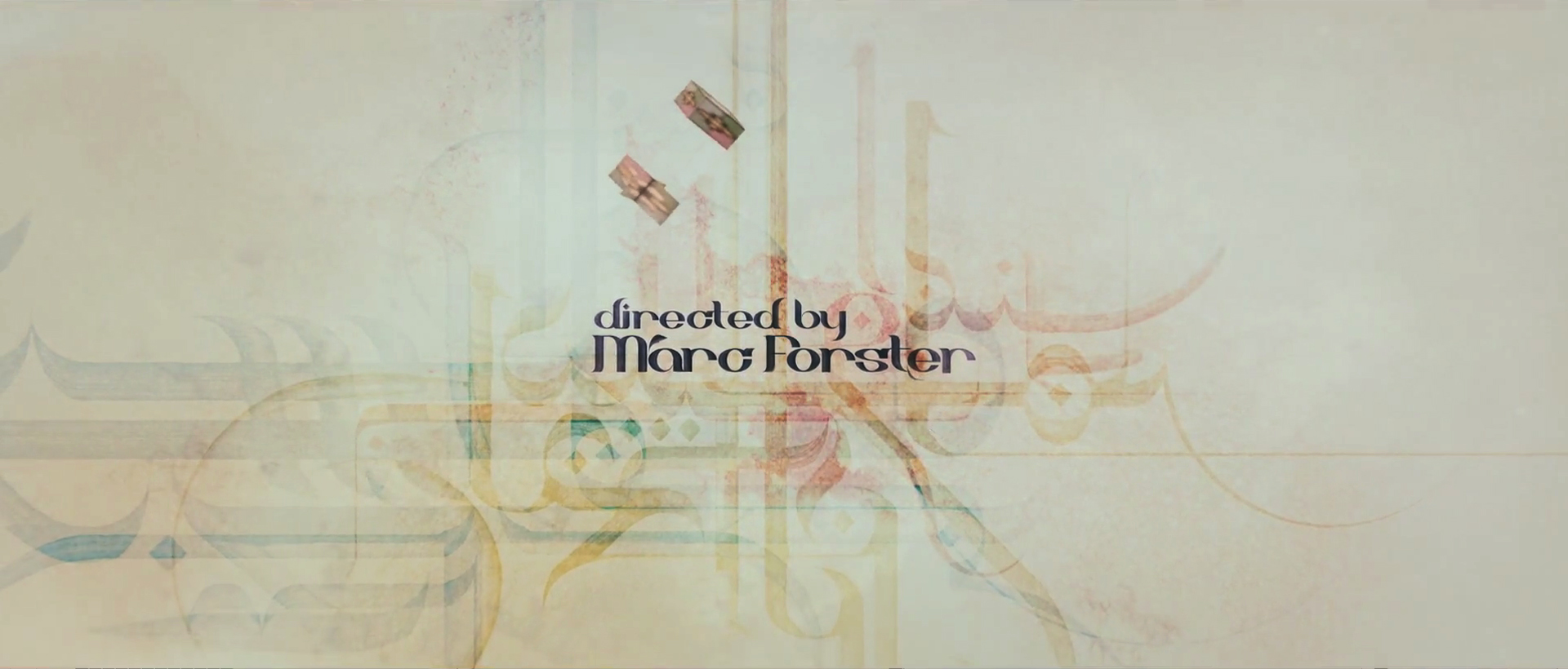
Main Title
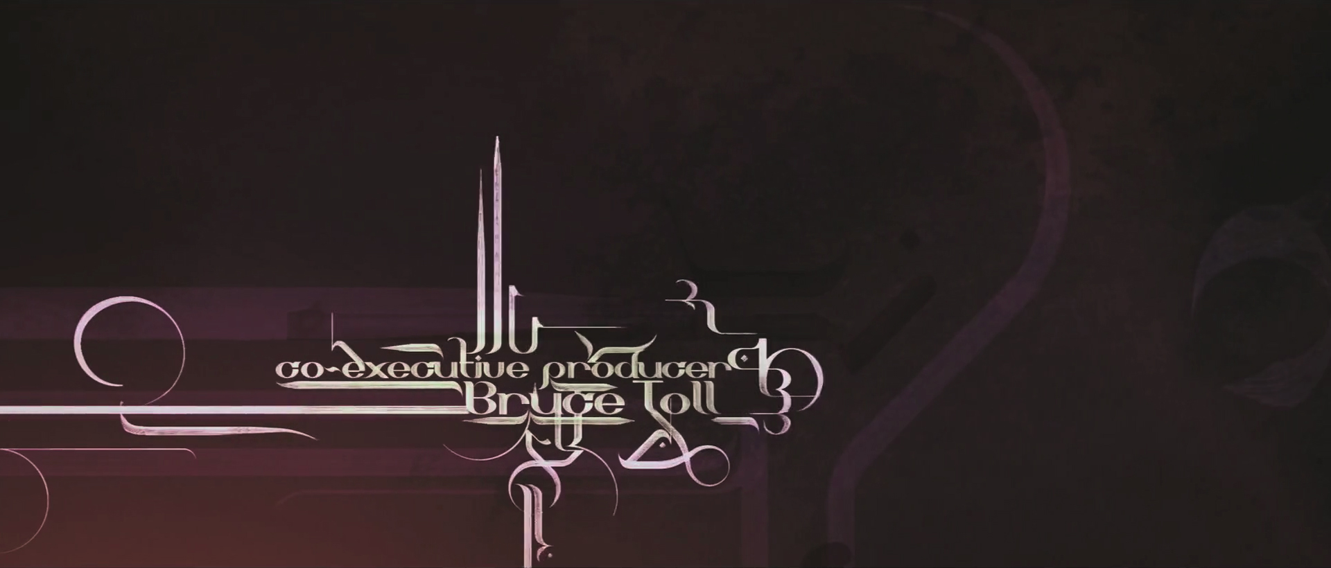
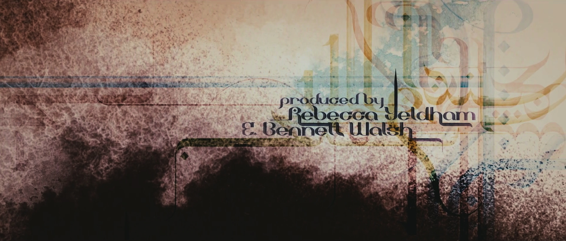
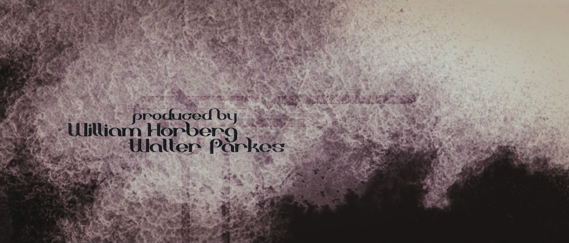
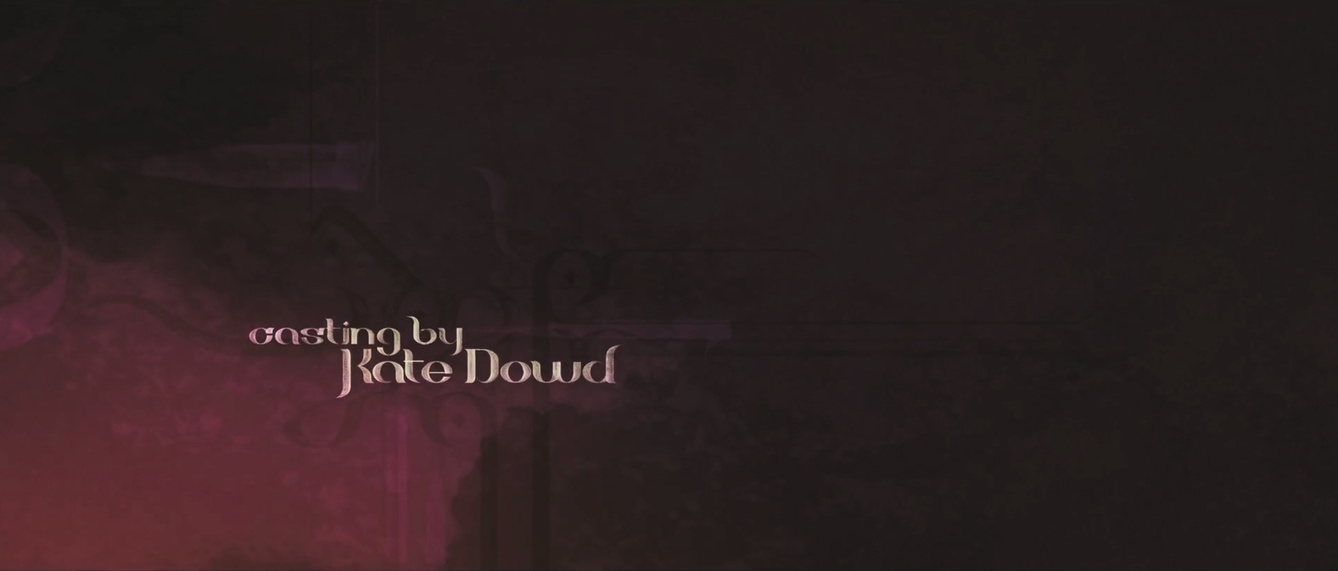
A masterclass in typography with Ben Radatz of MK12. These calligraphic compositions flow like ink in motion, elegant, expressive, and deeply tied to the film’s cultural roots. Each letterform is composed into a balanced layout that feels hand-assembled, with every title settling gently into frame. The compositions build up in layers, starting with textured backdrops, aged paper, stains, and subtle patterns paired with graceful camera moves that guide us fluidly through the sequence.
We created what felt like a crazy pipeline to achieve the effect we wanted, the leading edge of each stroke feeling tapered, like liquid ink meeting paper. The result though, is still very satisfying to me because it’s simply animated type, but with a lot of style. And as Tom Robbins says, “The most important thing in life is style.”
