
World Economic Forum
Knowledge Series
Social Explainer
Social Explainer

A detailed annual assessment of the competitiveness of countries around the world, this report aims to help policymakers, business leaders, and other stakeholders understand what drives productivity, prosperity, and long-term growth in different economies.
The World Economic Forum approached me to help create a 2-minute video explainer to synthesize the data and drive higher engagement across their social channels. I worked on all aspects of this piece, from concept to final delivery.
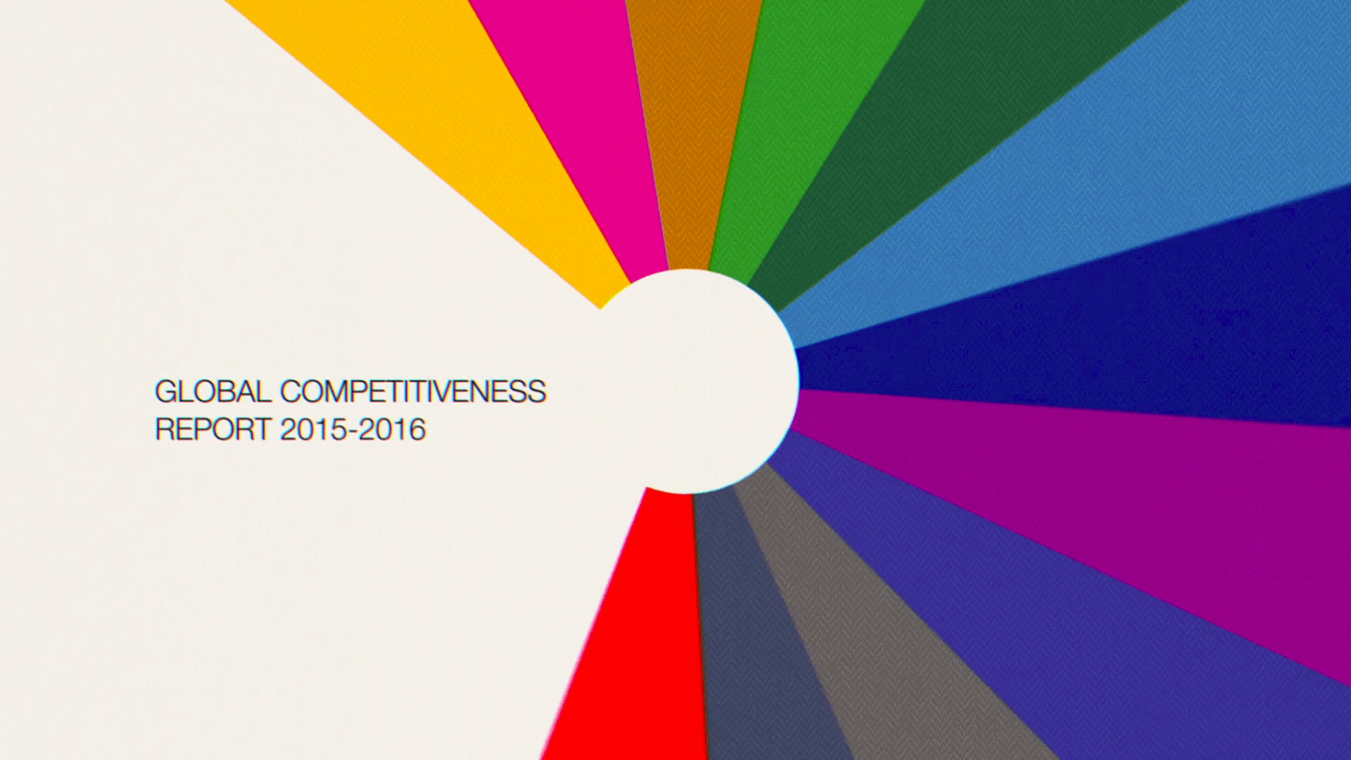
I developed a graphic language rich in iconography and simple geometric forms, leaning into a bright color palette to feel visually uplifting and to clearly identify each of the 12 pillars.

The visual foundation combined iconography, bold color, and graphic elements inspired by cartography and global projection systems. The piece opens with Buckminster Fuller’s Dymaxion projection, a less conventional, but far more visually engaging choice, not unlike Vignelli’s NYC MTA map in its reimagining of familiar forms. The Mercator projection appears where geographic clarity is essential, helping anchor country-specific data. Overall, the idea of mapping the planet through the lens of the Forum’s data felt like a natural and compelling visual extension of its global mission.


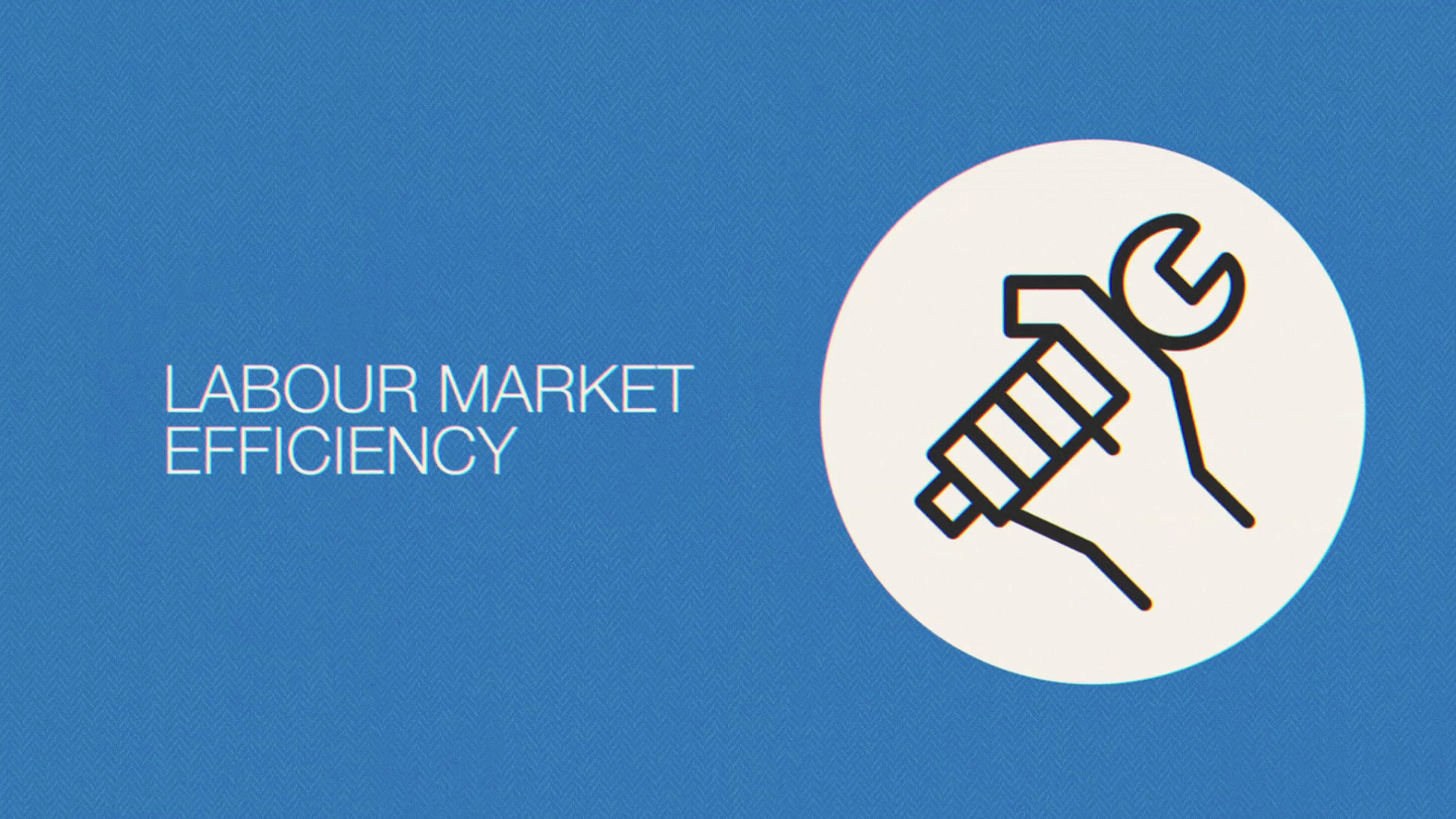

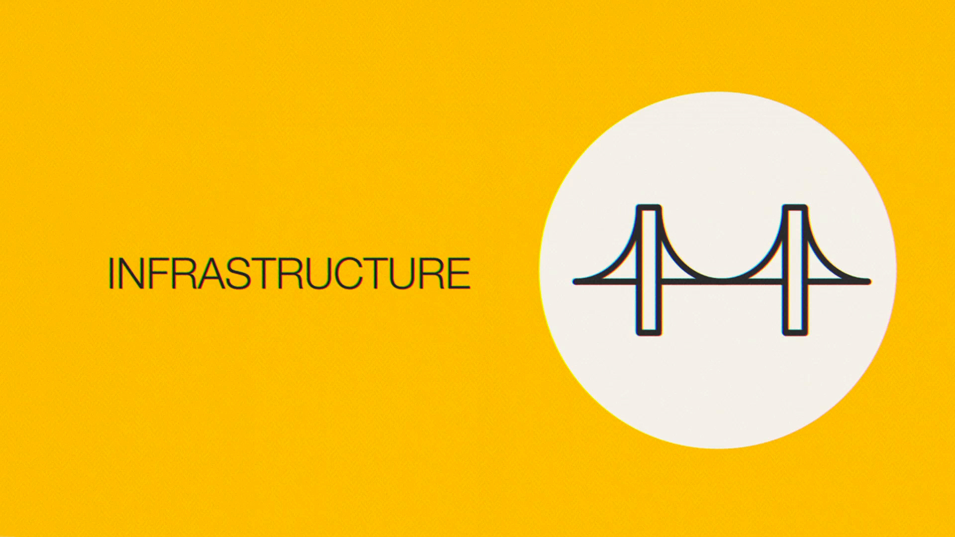
Institutions, Infrastructure, ICT Adoption, Macroeconomic Stability, Health, Skills, Product Market, Labour Market, Financial System, Market Size, Business Dynamism, and Innovation Capability.
The 12 key pillars were represented visually with clean, minimal symbols—designed for quick recognition and flexible organization. At the center was a radial graphic, symbolizing the Forum itself, with each pillar emanating outward like spokes of insight, reinforcing the idea of a connected, data-driven ecosystem.